2014 Spectroscopy Salary Survey: Change is Afoot
Our annual salary survey takes a look at the employment markets faced by spectroscopists in 2014. The results are surprising.
Our annual salary survey took a look at the employment markets faced by spectroscopists in 2014, and the results were surprising. The average salary has decreased for the first time since 2008, with government and nationally funded laboratory employees experiencing the biggest drop in average salary.
The Spectroscopy editorial team has taken a snapshot of the employment market for spectroscopists for more than 11 years. Over this time, the market has remained stable with some fluctuations here and there. This year, however, we report a drop in average salary of 7% from $88,018 in 2013 to $81,990 in 2014. This is a very different picture from the brighter one presented in 2013 and the factors contributing to it will be highlighted and examined here.
The survey was released to subscribers over the months of October and November 2013. A total of 572 respondents began the survey and 87.6% completed it. The format and questions of the survey were identical to those formulated in 2013 with the option to skip questions enabled. That meant that differing numbers of responses were collected for each question. The data collected are presented as percentages rather than raw numbers and should be considered when making comparisons between figures. Here are some overall statistics from the data:
- Age range: 20% <40 years; 26% 40–50 years; 33% 50–60 years; and 22% 60+ years.
- Gender: 25% female and 75% male.
- Employment status: 90% in full-time employment.
- Primary field of analysis: 57% analytical chemistry; 9% environmental, 7% pharmaceuticals; 4% agriculture/food; 3% biotechnology; 2% electronics/semiconductors; 2% energy and petroleum; 2% forensics and narcotics; 5% instrumental design/development; 2% medical biology; 2% metallurgy; 3% organic chemicals; <2% plastics/polymers/rubber, <2% ceramics; and <2% inorganic chemicals. (See Figure 1 for comparison to 2013).
- Area of employment: 56% commercial; 28% academic; and 16% government or nationally funded laboratory.
- Education level: 44% doctoral degree; 23% master's degree; 29% bachelor's degree; and 4% associate degree.

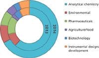

Figure 1: The six biggest areas of expertise: (a) Inside chart: Proportion of respondents in 2013; (b) Outside chart: Proportion of respondents in 2014.
As shown in Figure 1, the six biggest specialty areas reported have remained the same as in 2013. Two interesting points to note are that the proportion of respondents who said their primary field of expertise is in the pharmaceutical industry has decreased from 11% in 2013 to 7% in 2014, whereas the proportion of respondents who said their primary field of expertise is analytical chemistry has increased from 49% in 2013 to 57% in 2014. Furthermore, the proportion of respondents focused on agriculture/food analysis increased from 2% in 2013 to 4% in 2014.
Before looking at the data in greater detail, one important event in 2013 to acknowledge is the change to funding of scientific research in the United States (U.S.). In 2011 the U.S. government passed the Budget Control Act, seeking to cut $38 billion in nondefense spending (1). The law took effect in March 2013 and led to the automatic across-the-board government spending cuts popularly known as the "sequester." According to a survey of more than 3700 scientists performed by the American Society for Biochemistry and Molecular Biology, the effects of the cuts have been far-reaching in scientific fields (2). The survey documented that "55% of respondents had a colleague who had lost a job or expected to in the near future."
Salaries: On the Money?
This year's decline in the average salary from $88,018 in 2013 to $81,990 — a 7% drop — is only the second time that a decrease has been observed since 2002 (Table I). Table II digs into this decline a little deeper, showing average salaries in 2013 compared to 2014 according to gender, employment sector, highest education level achieved, and age. Some responses are highlighted below:
- 16% of respondents working in government or nationally funded laboratories reported an average salary of $75,387 (25% lower than in 2013).
- More than half of respondents (56%) working in commercial industry reported an average salary of $91,078 (4% lower than in 2013).
- More than a quarter of respondents (28%) employed in academia reported an average salary of $67,804 (5% lower than in 2013).
- PhD holders reported the highest average salary with an average salary of $97,936 (5% lower than in 2013).
- Master's degree holders reported an average salary of $72,144 (13% lower than in 2013).
- Bachelor's holders reported an average salary of $73,188 (11% lower than in 2013).

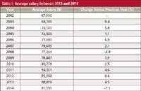
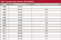
Table I: Average salary between 2013 and 2014
These responses indicate that respondents employed in government or nationally funded laboratories have experienced the biggest decrease in average salary compared to other industry sectors. It also appears that a higher level of education helps protect respondents from decreases in salary.

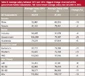
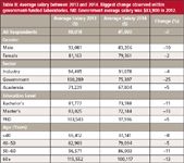
Table II: Average salary between 2013 and 2014. Biggest change observed within government-funded laboratories. NB: Government average salary was $83,900 in 2012.
Employment Status
The longer the period of service with one company, the greater the financial reward, as shown in Table III. The lowest average salary ($80,339) is reported by respondents who have been with their current employer less than 10 years, whereas the highest average salary of $96,975 is reported by respondents with more than 40 years service with their company.

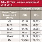
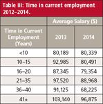
Table III: Time in current employment 2012â2014.
However, Figure 2 shows that the numbers of respondents who stay with the same employer for this length of time are significantly declining.

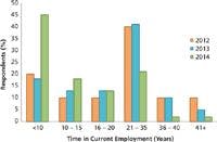
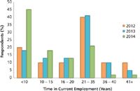
Figure 2: Time in current employment 2012â2014.
- In 2014, 45% of respondents reported service of less than 10 years (average salary $80,339), compared to 18% in 2013, and 20% in 2012.
- In 2014, 2% of respondents reported service of more than 40 years (average salary $96,875), compared to 5% in 2013, and 10% in 2012.
If spectroscopists are moving between employers, this could be a factor in the decline in salary seen this year. As the proportion of respondents reporting service of only 10 years or less with their current employer has more than doubled, the proportion of respondents at the lowest average salary has more than doubled compared to 2013. This could be a key factor in why the average salary has dropped so dramatically.
Employer Investment and Employee Satisfaction
It is a fair assumption that employer investment will improve the satisfaction of employees, but in a period of tightening budgets, investing in employees is generally not a priority. Equally, the fact that an increasing proportion of respondents are changing employers within 10 years suggests that investment may need to be made in different ways.
We asked respondents to indicate the financial incentives that employers offer, and documented the following responses:
- 81% of respondents receive healthcare coverage through their employer (down from 90% in 2013)
- 56% have a retirement or pension plan (60% in 2013)
- 53% have a 401(k) account (71% in 2013)
- 11% get childcare benefits (10% in 2013)
- 9% receive no benefits (5% in 2013)
These responses indicate the provision of financial incentives has decreased over the last year. However, we also investigated the provision of training by employers — whether or not employees are invited to attend in-house seminars and training courses — and found the following:
- More than half of respondents, 67%, are invited to seminars (44% in 2013)
- 85% are invited to training courses (55% in 2013).
These increases in the level of inhouse training may reflect the finding that employees are moving between jobs more often than in previous years and therefore require more training.
In addition to benefits and training, another important factor in employee satisfaction is workload. Figure 3 shows that over half of our respondents, 58%, stated that their workload had increased compared to a year ago. The reasons that were given:
- Increased business, 61%
- Staffing cuts, 48%
- New equipment, 36%
- New regulations, 27%

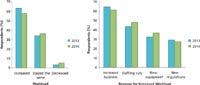
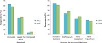
Figure 3: Perceived changes in workload together with the reasons given for the increase in both 2013 and 2014.
Regardless of the changes in the way that employers are investing and workloads are increasing, the majority of respondents (75%) reported that they were satisfied with their jobs.
Ambitions of Spectrocopists in 2014
As discussed, our respondents are moving between job roles more than in previous years. This year we asked respondents about their intentions to look for a new job. Almost a third (30%) expressed the intention to look for alternative employment within the next year, a 4% increase over 2013 and a 9% increase over 2012. This indicates that spectroscopists are becoming increasingly mobile within the employment market. The reasons given this year for making a move were:
- Dissatisfied with employer, 31% (11% in 2013)
- Dissatisfied with workload, 19% (6% in 2013)
- Personal reasons, 26% (8% in 2013
- Seeking higher salary, 52% (23% in 2013)
- Decreased expectations of salary, 3% (2% in 2013)
- Looking for more responsibility, 28% (13% in 2013)
- Looking for a new challenge, 50% (20% in 2013)
- Change in employer type, 21% (6%)
- Change in employment industry, 14% (3% in 2013).
These responses indicated that a greater proportion of respondents are unhappy with their employer, are looking to change employment industry or type, and are looking for a higher salary than in 2013. At the same time, some respondents are looking for more responsibility and new challenges, suggesting a greater level of ambition than in 2013.
Geographical Variation
Every year we examine regional variations in salaries, because such variations have an important effect on the attitude of workers: 33% of respondents stated that they would stick out a dissatisfactory job because of the location. Figure 4 compares the average salaries of different regions between 2013 and 2014. A more detailed breakdown follows below:

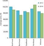
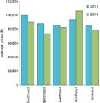
Figure 4: Comparison of the average salary in each geographical region reported in 2013 and 2014.
Northeast
The Northeast has crept up from second position in 2013 to first, with a 13% increase in average salary from $93,646 to $106,318. Here, 24% of respondents work in academia (a 5% increase compared to 2013). Furthermore, the proportion of respondents in the Northeast that work in government or nationally funded laboratories has dropped from 16% to 10%.
Southwest
The Southwest has dropped one place with a 10% decrease in average salary, from $100,078 in 2013 to $90,271 in 2014. Commercial industry employs 63% of respondents in this region (53% in 2013), and government or nationally funded laboratories employ 15% of respondents (22% in 2013). In comparison, 22% of respondents work in academia (21% in 2013).
Southeast
The Southeast retains its 2013 position at third place, with an average salary of $82,175 ($85,666 in 2013). Academia employs 27% of respondents (16% in 2013), 21% of respondents work at government or nationally funded laboratories (31% in 2013), and commercial industry employs 52% of respondents (49% in 2013).


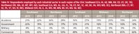
Table IV: Respondents employed by each industrial sector in each region of the USA: Southwest (CA, HI, AZ, NM, NV, CO, UT, OK, TX), Northwest (OR, WA, ID, MT, WY, AK), Southeast (LA, MS, AL, GA, FL, TN, KY, NC, SC, AR, DE, VA, WV, MD, DC), Northeast (MA, CT, NY, NJ, PA, VT, NH, RI, ME), Midwest (OH, IN, IL, IA, MO, MI, MN, WI, KS, ND, SD, NE).
Midwest
The Midwest remains in fourth place with an average salary of $78,982 in 2014 ($84,890 in 2013). Academia employs 19% of respondents (29% in 2013), government or nationally funded laboratories employ 11% of respondents (16% in 2013), and 60% of respondents work in commercial industry (65% in 2013).
Northwest
The Northwest region has dropped from third place in 2013 with an average salary of $87,776 to fifth place with an average salary of $73,510. This is a difference of 16%, the biggest change observed in any of the regions. Academia employs 28% of respondents in this region (36% in 2013), government or nationally funded laboratories employ 17% of respondents (36% in 2013), and commercial industry employs 50% of respondents (28% in 2013).
It appears that if you want the highest salary, the northeast is the place to go. However, when asked for an opinion about the state of the employment market, one respondent said "In the northeast where I live, [there are] few jobs. I commute two hours a day because that is where the job was." The statistics clearly don't tell the entire story.
Gender Divide
Gender inequality in the workplace is an issue that is never far from the mind when considering salary and employment. This year, our survey results suggest that the gap is closing, with the average salary for men at $83,356 (a 10% drop compared to 2013); whereas the average salary for women is $79,361 (down 2% compared to 2013). In 2013, the difference in average salary for men compared to women was $11,918; that has now dropped to $3995 in 2014. Factors that could have resulted in these changes are discussed below.
Management
Figure 5 shows that the proportion of male versus female respondents in management positions has remained steady — 46% of males hold management positions compared to 40% of females — suggesting that other factors apart from seniority are responsible for the existing salary difference.


Figure 5: Respondents in positions of management. Inside circle: Male respondents. Outside circle: Female respondents.
Education
Education level directly correlates to the average annual salary (as shown in Table II). Figure 6 shows the proportion of respondents who have reached each level of education. Nearly half of male respondents (47%) are holders of doctoral degrees compared to 34% of female respondents. However, the proportion of women with a doctoral degree has increased from 24% in 2013, whereas the proportion of men remains unchanged. This small discrepancy between men's and women's average salary in our survey is likely the result of the higher education levels among our respondents.

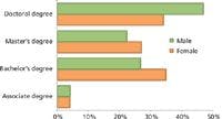
Figure 6: Highest education level attained according to gender.
Employment Industry
The biggest employer of our respondents is commercial industry, employing 56% of male respondents and 49% of female respondents, offering an average salary of $91,078. The smallest employer was government and nationally funded laboratories, with an average salary of $75,397, employing 17% of male respondents and 13% of female respondents.
Reviewing Career Choices
Just over half of respondents (51%) would recommend their career as a fulfilling one to a recent graduate, whereas 11% would not. We also asked for the best career advice respondents had received during their career. Responses ranged from "work hard" and "challenge yourself" to "be aware of industrial regulations" and "stay close to the fundamentals." A selection of responses is shown below:
- "Make broad ties with your work community by joining professional groups. Volunteer — connections and networks are valuable for personal and professional [reasons]."
- "Always put just a little bit more in than you are paid for. Genuine and enthusiastic colleagues get good references and are less likely to lose their jobs."
- "Never trust in automatization and software that separate the investigator and the object."
Conclusion
This year's survey suggests that the employment market for spectroscopists is changing. Overall, however, satisfaction levels remain comparable to 2013, regardless of decreases in salary and financial incentives.
Methodology
The staff of Spectroscopy designed the 2014 Spectroscopy salary survey and administered it using an on-line survey tool. A link to the on-line survey was successfully sent to 25,429 subscribers, and a total of 572 individuals responded. The field time for the survey was from October through December 2013 (with two reminder e-mails sent out on November 7 and November 18, 2013). To encourage participation, subscribers who responded to the survey were entered into a drawing to win a $100 gift card.
References
(1) American Association for the Advancement of Science (AAAS), "AAAS Analysis: Federal R&D and Sequestration – Summary," September 27, 2012,
.
(2) The American Society For Biochemistry and Molecular Biology, "Nondefense Discretionary Science: 2013 Survey," http://www.asbmb.org/uploadedFiles/Advocacy/Events/UPVO%20Report%20V2.pdf.